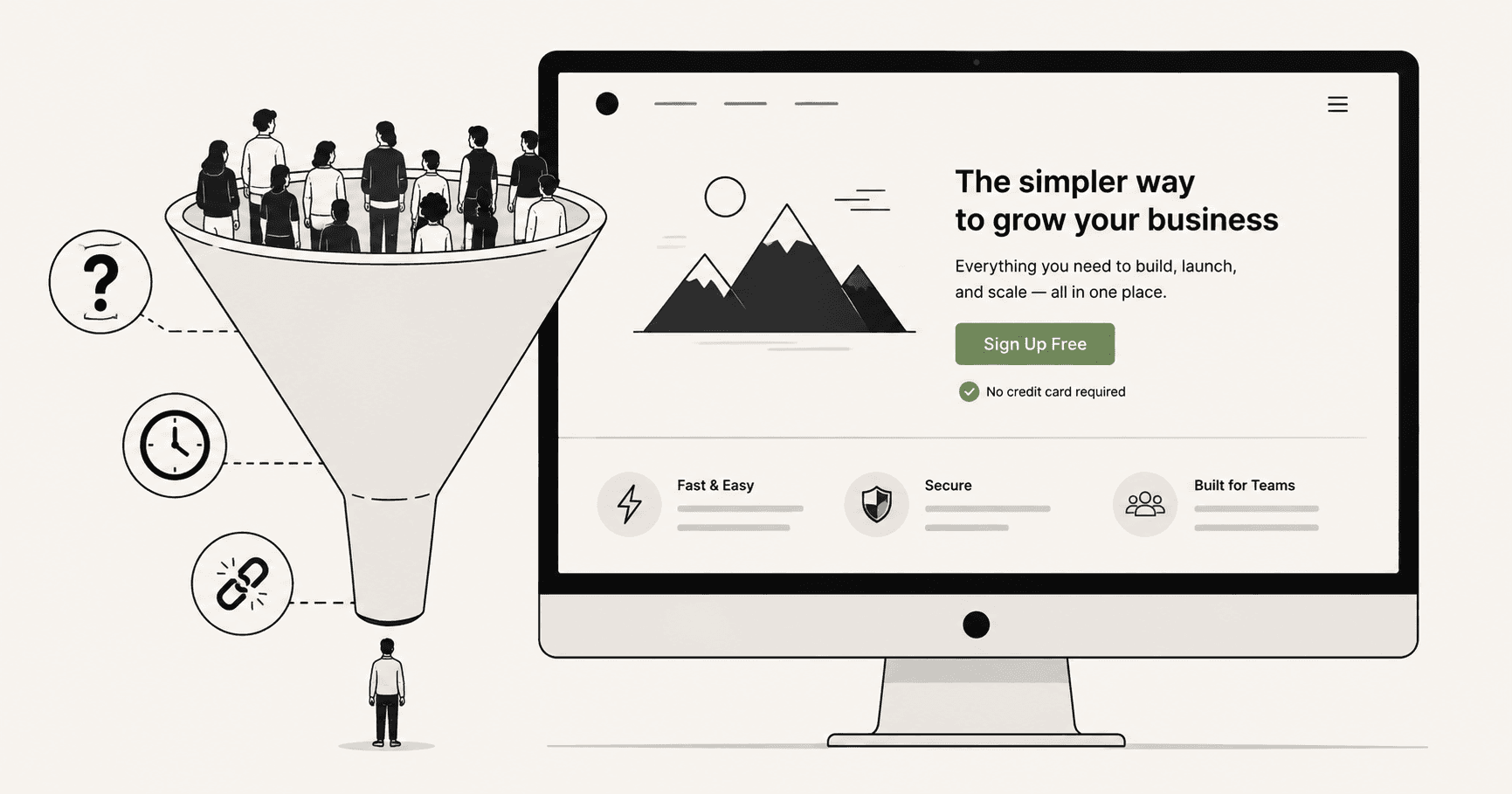
You built the page. You wrote the copy. You picked the colours, chose the font, added the testimonials. You ran the ad. The traffic came.
And almost nobody converted.
This is one of the most demoralising experiences in digital marketing — not because the failure is surprising, but because you did everything right. The page looks professional. The offer is clear. The button is visible. By every reasonable measure, it should be working.
But it isn't.
The instinct at this point is to start changing things. Rewrite the headline. Try a different hero image. Change the button colour. Add more social proof. Strip out the navigation.
Sometimes one of those changes helps. More often, it doesn't — because the real reason the page isn't converting is something different entirely. Something that doesn't show up when you look at the page itself. Something that only appears when you look at how real visitors actually behave on it.
Here's what's actually killing your landing page conversions — and how to find it.
The real job of a landing page
Before diagnosing what's wrong, it helps to be precise about what a landing page is actually supposed to do.
A landing page has one job: take a visitor who arrived with a specific intent and convert that intent into action.
That definition contains the most important word in landing page optimisation: intent.
A visitor doesn't arrive at your landing page as a blank slate. They arrived from somewhere — an ad, a search result, an email, a social post. That source gave them a specific expectation. They clicked because they expected to find something. And the moment they land on your page, they're asking one question before anything else: is this what I was looking for?
If the answer is yes, they stay and read. If the answer is no — or even maybe — they leave. Usually within five seconds. Usually forever.
This is why most landing page advice misses the point. It focuses on the page in isolation — the headline, the copy, the design, the CTA — without asking whether the page matches the expectation the visitor arrived with.
A beautiful, well-written, perfectly designed landing page that mismatches visitor intent will convert worse than an ugly, simple page that matches it exactly.
That mismatch is the most common reason landing pages fail. And it's almost never the first thing people fix.
The message-to-market match problem
There's a concept in direct response marketing called message-to-market match. It's simple: the message on your page needs to match the expectation of the market arriving at it.
On landing pages, this plays out as ad-to-page match. The ad makes a promise. The landing page needs to fulfil that promise — not just thematically, but specifically. The same language. The same offer. The same tone. The same level of urgency.
When there's a gap between the ad and the page, visitors feel it immediately. They can't always articulate it, but something feels off. The ad said "double your conversion rate in 7 days" and the landing page opens with "Welcome to our analytics platform." Those are different conversations. The visitor came for one thing and found another.
Even small gaps cause friction. An ad that targets small ecommerce stores landing on a page with enterprise case studies. An ad offering a free trial landing on a page that leads with pricing. An ad with urgent, punchy copy landing on a page with long, measured paragraphs.
How to check for this: Read your ad. Then immediately open your landing page and read the first sentence of your headline. Do they feel like the same conversation? Does the landing page answer the implicit question the ad created? If you have to think about it, there's a gap.
The 6 actual reasons landing pages fail
1. The headline does too much work — or not enough
Your headline has one job: make the visitor want to read the next line.
Not explain the entire product. Not list every feature. Not make a clever joke. Just create enough curiosity or relief that the visitor's eyes move downward instead of to the back button.
Most landing page headlines fail in one of two ways.
They're too vague: "The better way to grow your business." Grow how? Better than what? For whom? This kind of headline makes no promise and creates no desire. It sounds like every other SaaS landing page on the internet.
Or they're too detailed: a headline that tries to explain the product, the target audience, the main benefit, and the key differentiator all in one sentence. The visitor's brain can't process it fast enough and moves on.
The best landing page headlines are specific and simple. They name a problem the visitor recognises, or a specific outcome they want. "Stop losing leads at checkout" is better than "Conversion optimisation for modern ecommerce." The first one speaks to a feeling. The second one describes a category.
2. The page asks for commitment before building desire
Every landing page asks the visitor to do something — sign up, buy, book a call, download. That ask is a transaction. The visitor gives you something (email, money, time, trust) and expects something valuable in return.
The problem is that most landing pages ask for that commitment too early — before the visitor has enough information to feel confident saying yes.
Think about how trust actually builds in person. You don't ask someone to marry you on the first date. You build familiarity, demonstrate value, remove uncertainty. The same principle applies on a landing page.
If your CTA appears before you've answered the visitor's main objections — "will this actually work for me?", "what happens after I click?", "can I trust these people?", "is this worth my time?" — you're asking for commitment before you've earned it.
The fix isn't always more copy. Sometimes it's reordering what you have. Put your strongest proof point earlier. Address the biggest objection before the first CTA. Lead with outcome, not process.
3. The page is trying to serve too many visitors at once
Landing pages that convert well are ruthlessly specific about who they're talking to.
A page that tries to speak to founders, marketers, and enterprise teams simultaneously ends up speaking to none of them convincingly. Every example is generic. Every use case is vague. Every piece of social proof is safe and broad rather than specific and resonant.
This is especially common when a business runs multiple ad campaigns to the same landing page. The ad targeting is specific — one campaign targets Shopify store owners, another targets SaaS founders — but both ads land on the same generic page.
The result is a page that feels slightly off to everyone. The Shopify store owner sees a case study from a marketing agency. The SaaS founder sees an ecommerce example. Neither feels like the page was built for them, and people don't convert on pages that don't feel like they're for them.
The fix is segmentation. Different audiences deserve different landing pages — or at minimum, dynamic content that changes the headline and hero section based on where the visitor came from. This sounds like more work than it is. A second landing page with a changed headline, a different hero example, and a tweaked CTA can be built in an afternoon and often doubles conversion rate for that specific traffic source.
4. The page is slow — and you've stopped noticing
You've visited your landing page hundreds of times. Your browser has it cached. Your laptop is on fast WiFi. It loads in under a second.
Your visitors are on 4G, on a phone they've had for three years, clicking through from a social media ad they saw while commuting. For them, the page might take four seconds to load.
Google's research shows that 53% of mobile visitors abandon a page that takes more than three seconds to load. Not most. Not many. More than half. Gone before a single word of your carefully written copy has appeared on screen.
Page speed is invisible to the person who built the page and catastrophic to the visitor experiencing it. And because it's invisible, it's almost never the first thing people fix when conversions are low.
How to check: Run your landing page through Google PageSpeed Insights on mobile right now. A score below 70 is a significant problem. Below 50 is urgent. The tool also tells you exactly what's causing the slowness, so you know precisely what to fix.
Common culprits: unoptimised images, render-blocking scripts, too many third-party tools loading on page init, fonts that delay text rendering. Most of these have straightforward fixes that don't require a developer.
5. The form is asking for too much
Every field you add to a form reduces the number of people who complete it.
This is one of the most consistently proven findings in conversion optimisation, and yet most landing page forms still ask for more than they need. First name, last name, email, phone number, company name, company size, role, how did you hear about us.
Each field is a small friction point. Individually, none of them feels significant. Together, they create a form that feels like work — and people don't do work for products they haven't decided they want yet.
The phone number field is particularly damaging. Visitors know what a phone number means. It means a sales call. It means someone will call them. It means giving up privacy in exchange for a product they're not sure about yet. Drop-off spikes at the phone number field on almost every form that includes it.
The rule: only ask for what you absolutely need to deliver the next step. For a free trial, that's usually just an email address. For a booked call, it's name and email. For a lead magnet, it might be just an email. You can collect everything else later, once the visitor has experienced enough value to trust you with it.
6. There's no clear reason to act now
Visitors who don't convert on the first visit almost never come back.
This isn't cynicism — it's how attention works. The visitor who leaves your landing page intending to come back later will encounter seventeen other things between now and later, and your page will slip further and further down their mental priority list until it disappears entirely.
This means your landing page needs to give visitors a reason to act now, not later. Not fake urgency — countdown timers on evergreen offers insult the intelligence of modern internet users and damage trust. But genuine urgency, or at minimum, a clear articulation of what the visitor loses by waiting.
"Start your free trial — takes 30 seconds" creates mild urgency through friction reduction. "Your competitors are already fixing this" creates urgency through competitive anxiety. "Every week you wait is another week of data you'll never get back" creates urgency through loss framing.
None of these are manipulative. They're honest articulations of a real cost. The visitor who doesn't sign up today genuinely does lose something — time, data, competitive advantage. Saying so clearly is not a trick. It's useful information.
How to read your landing page data properly
Most people look at their landing page's conversion rate as a single number. That's almost always misleading.
A 2% conversion rate blended across all traffic sources hides enormous variation. Visitors from organic search might convert at 5%. Visitors from paid social might convert at 0.8%. Visitors on mobile might convert at 1.1% while desktop visitors convert at 4.3%.
These aren't the same problem. They require completely different fixes.
Before changing anything on your landing page, segment your conversion data by at minimum:
Traffic source — search, paid social, email, direct, referral. Each source brings visitors with different intent and different levels of familiarity with your brand. If one source converts dramatically worse than others, the fix might be in the ad or the email rather than the page.
Device — desktop vs mobile vs tablet. As discussed, these are often completely different experiences. A page that works on desktop frequently doesn't work on mobile, and blended data hides that entirely.
New vs returning visitors — returning visitors know you. They convert at higher rates. If new visitor conversion is very low, the page isn't doing enough to build trust fast enough for a cold audience.
Once you've segmented the data, look at behaviour — not just outcomes. Where are visitors dropping off? Are they bouncing immediately, suggesting a message mismatch? Are they scrolling but not clicking, suggesting the CTA isn't compelling enough? Are they clicking the CTA but abandoning the next step, suggesting the problem is post-click?
A tool like Wahilens tracks this behaviour automatically — every scroll, every click, every form interaction — and translates it into plain-English findings: "68% of mobile visitors exit your landing page without scrolling past the hero section. Estimated impact: ~$1,800/month in lost leads." That's not a metric to interpret. That's a specific problem with a specific fix.
A 20-minute landing page audit
If you want to diagnose your landing page right now, here's a structured process that takes less than half an hour.
Minutes 1–5: The stranger test. Open your landing page as if you've never seen it before. You have five seconds. What is this page offering? Who is it for? What do they want you to do? If you can't answer all three questions instantly, your visitors can't either.
Minutes 5–10: The mobile test. Turn off your WiFi. Open the page on your phone using mobile data. Time how long it takes to load. Read the hero section. Can you see the CTA without scrolling? Can you tap it without hitting something else? Go through the form on mobile. Count the fields. Time how long it takes to complete.
Minutes 10–15: The ad match test. Open the ad, email, or link that sends traffic to this page. Read it. Then open the landing page. Does the headline continue the conversation the ad started? Does the tone match? Does the offer match? Is the same language used? Mark anywhere the visitor might feel a disconnect.
Minutes 15–20: The objection test. Write down the three biggest reasons someone would not convert on this page. Then read the page and find where — or whether — it addresses each one. If an objection isn't addressed before the first CTA, it's a conversion barrier that's costing you.
At the end of 20 minutes, you'll have a prioritised list of problems. Fix the biggest one first. Measure the result. Move to the next.
The uncomfortable truth about landing pages
Here's what most landing page advice doesn't tell you.
The page is rarely the main problem.
The main problem is usually the gap between what brought the visitor to the page and what the page delivers. The mismatch between expectation and reality that happens in the first five seconds. The ad that promised one thing and the page that delivered another.
Fix the message match first. Then fix the page speed. Then fix the form. Then look at the copy.
And through all of it — measure. Not just conversion rate, but behaviour. Not just outcomes, but the specific moments where visitors decide to leave instead of act.
The page that converts isn't necessarily the most beautiful one, or the one with the most social proof, or the one with the cleverest headline.
It's the one that made the right visitor feel, in the first five seconds, that they were exactly where they were supposed to be.
Everything else is secondary.
See it in action
Know exactly where your visitors drop off.
One script tag. No credit card. Your first report in under a week.
Start free trial