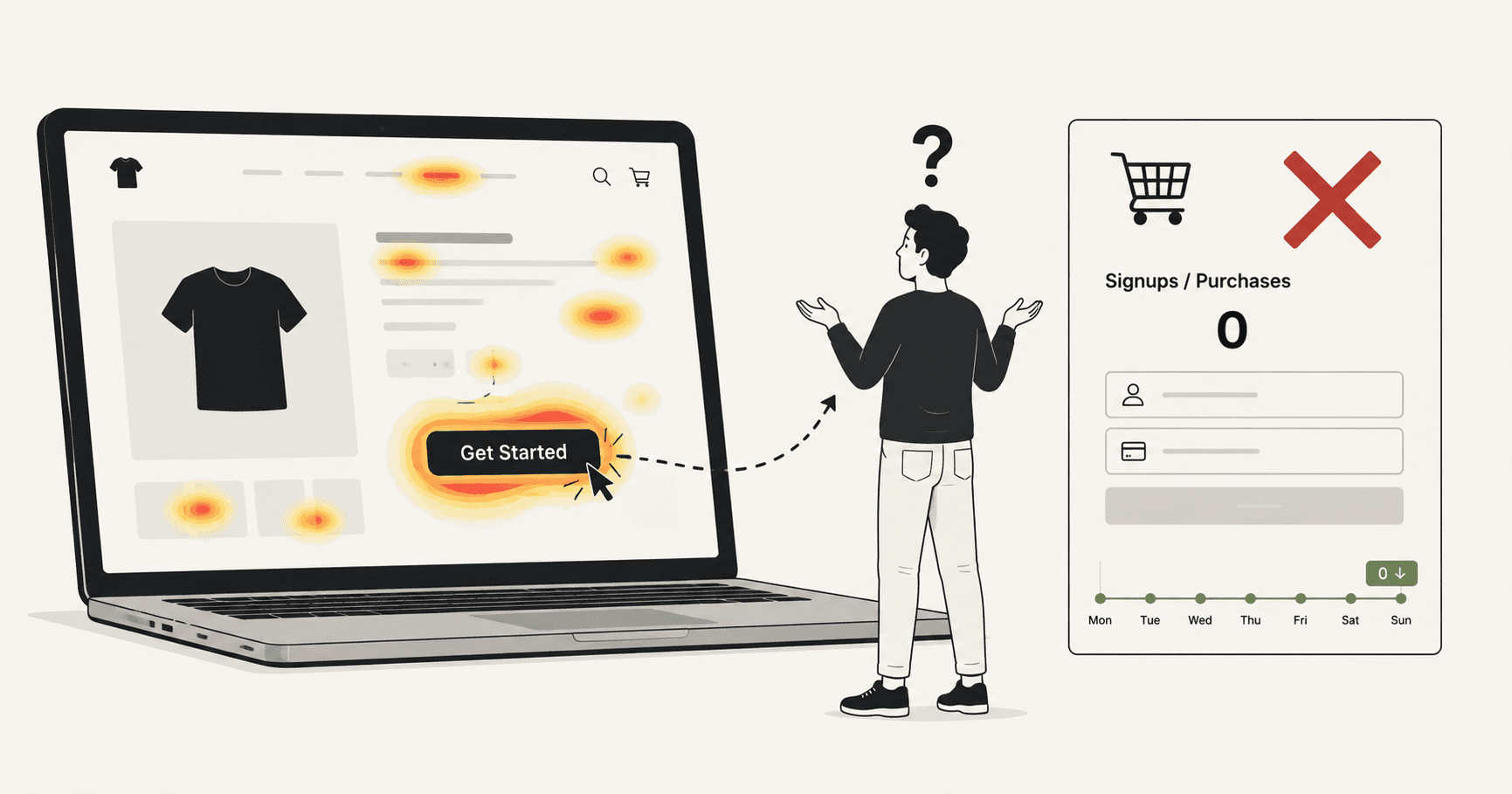
You installed a heatmap tool. You watched the recordings. You checked the click map.
Your CTA button is glowing red. Lots of clicks. Good engagement. The data looks healthy.
And yet — barely anyone is converting.
This is one of the most disorienting experiences in conversion optimisation. The tool tells you one thing. The revenue tells you another. And you're left staring at a red blob on a screen wondering what you're missing.
Here's what you're missing: heatmaps show you where people click. They tell you almost nothing about why people don't.
And the reason your CTA is failing almost certainly lives in that gap.
Why everyone trusts heatmaps
Heatmaps became popular because they solved a real problem. Before them, website analytics was almost entirely numbers — page views, bounce rates, session duration. Abstract data that told you something was wrong but gave you no visual intuition for what.
Heatmaps changed that. Suddenly you could see your website through your visitors' eyes. You could watch where attention gathered, where eyes travelled, where fingers tapped. It felt like finally being able to watch customers in a shop rather than just reading the till receipts.
That visual immediacy is genuinely useful. Heatmaps are good tools. The problem isn't the tool — it's what people assume the tool tells them.
A red hotspot on your CTA means people are clicking it. It does not mean people are converting. It does not mean the click is working. It does not mean the button is doing its job. It just means fingers are landing on that coordinate on the screen.
What happens after the click — and why so many people aren't clicking at all — is completely invisible to a heatmap.
What heatmaps actually show vs what they hide
To understand the gap, it helps to be precise about what a heatmap actually measures.
What a heatmap shows you:
- Where on the page clicks are concentrated
- Which elements attract the most attention
- How far down the page visitors scroll
- Where on mobile visitors are tapping
What a heatmap cannot show you:
- Whether a click actually did anything
- Whether the visitor clicked in frustration because nothing was happening
- Whether the visitor tried to click something that wasn't clickable
- Whether the visitor hesitated, moved toward the button, and then left without clicking
- Which form field caused someone to abandon the page
- Whether the CTA was even visible on the device the visitor was using
- What the visitor did in the seconds before they left
That second list is where CTA failures actually live. And heatmaps are blind to all of it.
The 4 CTA failure modes heatmaps completely miss
1. Dead clicks
A dead click is when a visitor clicks on something that isn't clickable — an image they expected to be a link, text that looks like a button, an element that looks interactive but isn't.
Dead clicks are a signal of broken expectation. The visitor wanted to do something. They tried. Nothing happened. They either try again, get confused, or leave.
Heatmaps register dead clicks as clicks. They look identical to successful clicks on the heat map — same red blob, same visual weight. There's no way to look at a heatmap and distinguish between "this button is working well" and "visitors keep clicking this broken element in frustration."
If your CTA has a hotspot but low conversion, dead clicks might be why. Visitors are clicking — but the click isn't registering, or the page isn't responding the way they expect.
2. Rage clicks
A rage click is when a visitor clicks the same element repeatedly in rapid succession — usually because the page is slow to respond, the button appears unresponsive, or something broke.
It's one of the strongest frustration signals in behavioural analytics. A visitor who rage clicks is not engaged. They're angry. And angry visitors leave.
On a heatmap, rage clicks look like enthusiasm. The hotspot gets hotter. The blob gets redder. It looks like your CTA is performing brilliantly when in reality visitors are hammering it in frustration because it isn't working.
This is one of the most dangerous blind spots in heatmap analysis — because the data actively misleads you. High click concentration on a CTA that's experiencing rage clicks will look like success until you look at conversion data and realise it isn't.
3. Hesitation and exit
This one is perhaps the most significant CTA failure mode of all — and heatmaps are completely blind to it.
Most visitors who don't convert don't ignore your CTA. They see it. They consider it. They move their cursor toward it, or their thumb hovers over it on mobile. And then something stops them. A question they can't answer. A risk they can't accept. A moment of uncertainty that tips them toward leaving instead of clicking.
That moment of hesitation — the near-click that became an exit — produces no data on a heatmap. The visitor didn't click, so nothing is recorded. The heatmap shows you the clicks you got. It cannot show you the clicks you almost got, or why they didn't happen.
Understanding hesitation requires a different kind of data: scroll depth combined with exit point, time on page before exit, mouse movement patterns, the specific moment someone leaves. None of that is in a heatmap.
4. The invisible CTA
Here's a scenario that plays out on thousands of websites every day.
A page was designed and tested on a 1440px desktop monitor. The CTA sits perfectly above the fold — prominent, visible, impossible to miss. The heatmap confirms it: the button gets the most clicks on the page.
But 70% of visitors are on mobile. And on a 390px iPhone screen, the CTA is below the fold. Visitors would have to scroll to find it. Many of them don't scroll — they leave.
The heatmap for mobile might show almost no clicks on the CTA — but it cannot tell you that those visitors never saw it. It cannot show you the relationship between scroll depth and exit rate. It cannot tell you that the visitors who did scroll and find the button converted at a high rate — which would prove that visibility, not copy or design, is the entire problem.
The fix in this case is trivial: move the CTA above the fold on mobile. But you'd never know that from a heatmap. You'd just see low clicks and start questioning your copy, your offer, your colours — optimising the wrong things entirely.
What behavioural data actually looks like
The difference between a heatmap and genuine behavioural analytics is the difference between a photograph and a diagnosis.
A heatmap takes a snapshot. It shows you a moment — where clicks landed across aggregated sessions. It doesn't show you the journey, the sequence, the frustration, or the decision.
Behavioural data tells you a story. It answers questions like:
- Which visitors clicked the CTA and then abandoned the next step?
- Which visitors scrolled past the CTA without clicking?
- Which visitors clicked something near the CTA that wasn't the CTA — suggesting they missed it or confused it with something else?
- Which visitors spent more than 30 seconds on the page and still didn't convert — suggesting they were interested but something stopped them?
- Which form field is causing the most drop-offs after someone does click through?
These questions have answers. But they require tracking behaviour across the entire session — not just aggregating click coordinates into a colour map.
This is what tools like Wahilens are built to do. Instead of a heatmap you interpret yourself, you get a plain-English finding: "Your CTA button is receiving dead clicks from 34% of mobile visitors. The button appears unresponsive for 2–3 seconds after tap on mobile connections. Estimated impact: ~$1,300/month in lost conversions."
That's not a blob on a screen. That's an instruction.
How to properly diagnose a failing CTA
If your CTA has traffic but isn't converting, here's the diagnostic process that actually works.
Step 1: Separate click rate from conversion rate. Your CTA might be getting clicks but not conversions. Or it might not be getting clicks at all. These are completely different problems with completely different fixes. Know which one you have before doing anything else.
If click rate is high but conversion rate is low, the problem is what happens after the click — the next page, the form, the checkout, the load time.
If click rate is low, the problem is the CTA itself — its visibility, its copy, its position, or its surrounding context.
Step 2: Check for dead clicks and rage clicks. Look at your behavioural data. Are people clicking the button multiple times in rapid succession? Are they clicking elements near the button that aren't clickable? These signals point to technical problems — slow page response, broken interactions, confusing layout — that design changes won't fix.
Step 3: Check mobile separately. Always. Always. Always segment your CTA analysis by device. A CTA that converts at 5% on desktop and 0.6% on mobile isn't a CTA problem — it's a mobile experience problem. The fix is completely different, and you'll never find it if you're looking at blended data.
Pull up your site on your phone right now. Is the CTA visible without scrolling? Can you tap it without accidentally hitting something else? Does the page respond immediately when you tap, or is there a delay?
Step 4: Look at what happens in the 10 seconds before exit. The moment before a visitor leaves is the most information-rich moment in the session. What were they doing? Had they scrolled past the CTA? Had they started to interact with something and stopped? Did they move toward the CTA and then leave?
Session-level data — not aggregated heatmaps — answers these questions. Look at exit patterns, not just click patterns.
Step 5: Form a specific hypothesis before changing anything. Based on what you find, write down a hypothesis before you touch a single thing. Not "the CTA needs to be better" — that's not a hypothesis. Try: "Moving the CTA above the fold on mobile will increase mobile click rate because currently 60% of mobile visitors exit without scrolling to the button's current position."
Specific problem. Specific fix. Specific expected outcome. Then test it, measure it, and move on.
The fix framework
Once you've diagnosed the actual problem, fixes usually fall into one of four categories.
Visibility fixes — the CTA isn't being seen. Move it above the fold, increase its size, increase contrast with the surrounding content, add whitespace around it so it doesn't compete with other elements.
Copy fixes — the CTA is seen but doesn't create enough motivation to click. The label is vague ("Submit", "Click Here", "Learn More") instead of specific and outcome-focused ("See my personalised report", "Start my free trial", "Get the template"). The surrounding copy doesn't build enough desire or remove enough risk before the CTA appears.
Trust fixes — the CTA asks for something the visitor isn't ready to give. A credit card before they're sold. Personal information before they understand the value. A commitment before they trust you. Add a risk-reducer near the CTA — "No credit card required", "Cancel anytime", "Free for 7 days" — and watch hesitation drop.
Technical fixes — the CTA is broken in some way the visitor can see but you can't. Slow response on mobile, broken on certain browsers, overlapped by a cookie banner, unresponsive on the first tap. These fixes are often the fastest wins because they're binary — once fixed, the friction disappears entirely.
Heatmaps aren't the problem. Stopping there is.
Heatmaps are useful. Run them. Look at them. Use the scroll depth data to understand how far visitors read before leaving. Use the click maps to confirm that important elements are getting attention.
But don't mistake a photograph for a diagnosis.
The information you need to fix a failing CTA — dead clicks, rage clicks, mobile exit patterns, form drop-offs, hesitation before leaving — lives underneath the heatmap, in the actual sequence of what real visitors did in real sessions.
Get that data. Ask why, not just where.
Your CTA doesn't need to be redesigned. It needs to be understood.
See it in action
Know exactly where your visitors drop off.
One script tag. No credit card. Your first report in under a week.
Start free trial