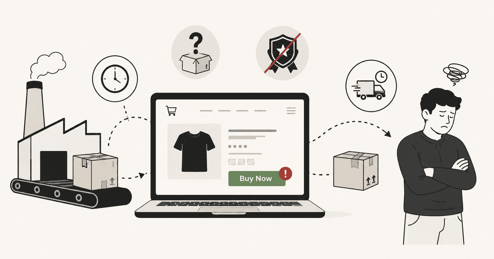
You set up the store. You found the products. You ran the ads.
People are clicking through. The traffic is real. But the sales aren't coming.
This is the most frustrating place to be in dropshipping — not the beginning, when you expect things to be hard, but the middle, when you've done everything you were supposed to do and it still isn't working.
The problem is almost never the product. And it's almost never the ads.
It's what happens after the click.
Visitors land on your store and something — sometimes one thing, sometimes several — makes them decide to leave instead of buy. And because it happens silently, most dropshippers never figure out exactly what it is. They tweak the ad. They change the product. They start over.
Here are the 7 mistakes that are most likely killing your conversions — and what to do about each one.
Mistake 1: Selling products nobody is actively searching for
Most dropshipping advice tells you to find a "winning product." What it doesn't tell you is that a winning product isn't just something that looks good on a TikTok ad — it's something people are already motivated to buy before they see your store.
There's a difference between a product that gets attention and a product that gets sales. Novelty gadgets and impulse buys can work with the right ad, but they're incredibly hard to convert because you're creating demand from scratch. The visitor clicks out of curiosity, not intent.
Products that convert reliably are ones that solve a problem people are already frustrated by. Something they've Googled. Something they've complained about. Something they were going to buy anyway — and you just showed up at the right moment.
How to check: Before building a store around a product, search for it on Google. Look at the search volume using a free tool like Google Keyword Planner or Ubersuggest. If people aren't searching for it, you're going to spend a lot of money on ads creating awareness that never converts to sales.
Mistake 2: Using your supplier's photos and description
This is the single most common dropshipping mistake, and it's also one of the most damaging.
When you copy your supplier's product photos and paste their description into your store, you've created an identical page to every other dropshipper selling the same product. The visitor may have already seen it somewhere else. They know it ships from China. They'll Google the product name and find it cheaper on AliExpress in 30 seconds.
Your product page is your entire sales pitch. It's the only thing standing between a visitor and a purchase. If that page looks generic, your store looks generic — and generic stores don't build enough trust to take someone's credit card details.
What to do instead: Take your own photos if you can order a sample. If you can't, at minimum rewrite the description completely. Don't list features — describe the outcome. Don't say "high-quality stainless steel construction." Say "won't rust after six months in your kitchen drawer like the cheap ones do." Talk to the specific frustration your customer has. Make it sound like a human wrote it, because a human should have.
Mistake 3: Hiding your shipping times until checkout
This one kills more dropshipping sales than almost anything else.
A visitor finds your product, likes what they see, adds it to cart, starts checkout — and then sees "Estimated delivery: 15–30 business days." They close the tab immediately. The sale is gone.
The problem isn't the shipping time itself. Long shipping times are a real limitation of dropshipping, but plenty of dropshippers build successful stores despite them. The problem is the surprise. When customers discover the shipping time at checkout, it feels like a bait and switch. The trust you spent the whole product page building evaporates in an instant.
What to do instead: Put your shipping time on the product page. Above the fold if possible. Yes, some visitors will leave when they see it — but those visitors were going to leave at checkout anyway. The ones who stay will be warmer, less surprised, and far more likely to complete their purchase. Transparency upfront filters out the wrong customers and builds trust with the right ones.
Better yet, lead with it. "Ships in 3–5 days from our UK warehouse" is a competitive advantage if you've found a supplier that can do it. Make it a feature, not a footnote.
Mistake 4: Expecting a brand-new store to convert without social proof
Put yourself in your customer's shoes.
They've never heard of your store. They found you through an ad on Instagram or TikTok. Your domain is six months old. There are no reviews, no photos of real customers, no names, no faces behind the brand.
Why would they give you their credit card number?
Trust is the foundation of every ecommerce conversion, and trust takes evidence. For an established brand, that evidence is reputation. For a brand-new dropshipping store, it has to be manufactured — carefully, honestly, and fast.
What actually builds trust on a new store:
- Import reviews from AliExpress or your supplier using a tool like DSers, Loox, or Judge.me. Even 20–30 reviews with photos make a meaningful difference.
- Add a real returns and refund policy — and make it generous. "30-day returns, no questions asked" removes the risk of being wrong. It costs you almost nothing and converts significantly better than a restrictive policy.
- Show real people. A simple about page with a photo and a genuine story does more for conversion than any design tweak. People buy from people, even online.
- Add trust badges at checkout — SSL indicators, accepted payment logos, security seals. These are table stakes. Their absence signals risk.
None of this requires an established reputation. It just requires effort — and most of your competitors won't bother.
Mistake 5: Pricing that signals "cheap AliExpress" not "curated store"
Dropshipping stores often underprice their products because they're scared of competition. If AliExpress has it for £8, they sell it for £12 and feel like that's a good margin.
But that pricing strategy has a hidden cost: it signals low quality.
Counterintuitively, pricing too low can actually hurt your conversion rate. When a product is suspiciously cheap, visitors assume there's a reason. They assume it's low quality. They assume there's a catch. And they leave — not because it's too expensive, but because it's too cheap to feel trustworthy.
Premium pricing, paired with a product page that justifies that premium, converts better than bargain pricing with a generic page. People aren't just buying a product — they're buying the feeling that they made a smart decision. A higher price, when supported by good photography, strong copy, and genuine social proof, signals quality and builds confidence.
Quick check: What does your pricing look like next to your competitors? If you're the cheapest option by a significant margin, consider whether that's helping or hurting you. Test a higher price point for two weeks and watch what happens to your conversion rate.
Mistake 6: Ignoring mobile — where almost all your ad traffic lands
If you're running Facebook, Instagram, or TikTok ads, the overwhelming majority of your traffic is on mobile. Not 60%. Not 70%. Often 85–90% of ad clicks come from people on their phones.
And yet most dropshipping store owners design and test their store on a laptop.
The experience on mobile is almost always worse than the experience on desktop — and the store owner has no idea because they never actually shop their own store the way a customer would.
The most common mobile problems on dropshipping stores:
- Product images that don't scale properly — cropped awkwardly, too small to see detail, or requiring pinch-to-zoom
- Add to Cart buttons that are too small or too close to other tappable elements, causing mis-taps and frustration
- Popups that are impossible to dismiss on a small screen — email capture popups, discount offers, cookie notices stacked on top of each other
- Checkout that requires too many steps — each additional screen on mobile increases abandonment
- Page speed that's acceptable on WiFi but brutal on 4G — images that haven't been compressed, scripts that load synchronously, fonts that block rendering
What to do: Turn off your WiFi. Open your store on your phone using mobile data. Go through the entire journey from ad click to checkout complete, timing yourself. If anything feels slow, confusing, or frustrating — your customers are feeling it too, and they're leaving because of it.
Do this once a month. Your theme updates, your app installations, and your page changes all affect mobile performance in ways that aren't always obvious until you test them properly.
Mistake 7: Not knowing which page is actually losing the sale
Here's the honest truth about mistakes 1 through 6: you might be making one of them, or you might be making all of them, or your biggest problem might be something completely different that's specific to your store.
Without data, you're guessing. And in dropshipping, guessing is expensive.
The most common response to low conversions is to change the product. The second most common response is to change the ad. Both of these can be the right move — but only if the product page or the ad is actually where the problem is. If your visitors are dropping off at checkout, changing your product won't help. If they're leaving the product page in under 10 seconds, changing your ad targeting won't help.
You need to know where in your store the sale is being lost before you can fix it.
This is what behavioural analytics is for. Not page views. Not bounce rates. Actual behaviour — where people click, where they stop scrolling, which form field makes them give up, which button they tap that does nothing.
A tool like Wahilens tracks all of this automatically. Every rage click, every dead click, every form drop-off — captured across every session, all week, without you having to set up a single event or read a single dashboard. Then instead of a spreadsheet to interpret, you get a plain-English finding: "62% of mobile visitors leave your product page without scrolling past the fold. Estimated impact: ~$900/month."
That's not a metric. That's a diagnosis. And a diagnosis tells you exactly which of the 7 mistakes above is actually your problem.
The pattern behind all 7 mistakes
Look back at the list and you'll notice something.
Every single mistake is a version of the same problem: the visitor didn't trust you enough, or didn't understand enough, or hit enough friction to decide that buying wasn't worth the risk.
Conversion isn't about tricks. It's not about countdown timers or fake scarcity or aggressive popups. Those things might squeeze a few extra sales in the short term, but they erode the trust that makes a store sustainable.
Real conversion rate improvement is about removing the things that make people hesitate. Bad photos make people hesitate. Hidden shipping times make people hesitate. A checkout with twelve fields makes people hesitate. A store with no reviews makes people hesitate.
Remove the hesitation, one thing at a time, starting with the biggest one first.
Start with your product page. Open it on your phone. Ask yourself honestly: if I had never heard of this store, would I trust it enough to buy?
If the answer is anything other than a confident yes — you know where to start.
See it in action
Know exactly where your visitors drop off.
One script tag. No credit card. Your first report in under a week.
Start free trial